Project
Summary
Responsibilities
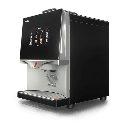
Nescafe Coffee machine UI
The small screen that is 6*6 inches was a play ground for Coffee dispensing of different sorts, with a Payment portal in built too
UI Design
Icons
Typography

Project under NDA , summing up my learnings
For someone who loves coffee, this was a fun project that I got to work on during my time at Tata Elxsi, Nescafe had its own trademark Font, colours and style, Our job was to leverage on it and create beautiful and mouth watering interface that would urge the Users to have a look and buy the products from the dispenser. I would love to show and tell offline
Live Project - I would love to discuss 1 :1
My learnings
When in design software the visual look good but in the display of such a device the dark gradient become black so color choices where highly conscious decisions
6*6 Screen with a payment gateway was challenging as the size of the QR code was too big for the layout however we manged to fit it in a readable size
My role
Created 1 option for the visual Style
Button styling and Iconography
Colors and layouts creation and experimentation
Style guide creation of the same
Tools Used


Tags
UI Design
UX Design
UX Design
Thank you for showing interest in my works
Next project
USER EXPERIENCE DESIGN
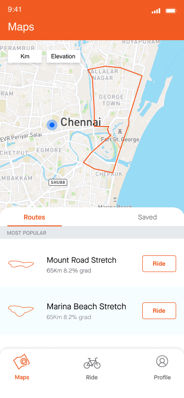
STRAVA - MAP BASED APP UX/UI REDESIGN FOR BETTER BEHAVIORAL PATTERNS AND USE CASES.

A 2 Week academic case study and redesign of activity tracking app, as a Part of the NID Course work
Next project
USER EXPERIENCE DESIGN
STRAVA - MAP BASED APP UX/UI REDESIGN FOR BETTER BEHAVIORAL PATTERNS AND USE CASES.

A 2 Week academic case study and redesign of activity tracking app, as a Part of the NID Course work


