Project
OBJECTIVE
Area of work
STRAVA APP REDESIGN
Enhance the usability and engagement of Strava’s map feature by making it a central tool for discovering routes, tracking activities, and fostering social interactions—ultimately driving higher retention and user satisfaction.
Primary research
Audit
Usability testing
Information Arch
Interaction design
Wireframing
Visual Design
UX Goal
Enhance Strava’s map for better route discovery, activity tracking, and social engagement to drive retention and satisfaction.
Final OUTCOME
1️⃣ Increased Map Engagement
20
%
📍 Goal: Boost the Map Interaction Rate by 20% within 3 months (measured via zooms, pans, and feature clicks).
2️⃣ Improved Usability & Efficiency
30
%
🚀 Goal: Reduce Time on Task for route creation by 30% (measured via usability testing & analytics).
3️⃣ Enhanced Feature Adoption
15
%
📈 Goal: Increase the Route Creation Rate by 15% within 6 months (tracked via saved/planned routes).
4️⃣ Drive User Retention
10
%
🔄 Goal: Improve Return Visit Rate for the map by 10% within 6 months (tracked via user session data).
Framework used
Elements of UX Design - Jesse Gerret
THE SCOPE OF THE PROJECT FOCUSED ON
STRUCTURE - Information Architecture, Interaction
SKELETON - Interface, Navigation & information
SURFACE - Visual Design

Elements of UX Design
How did we define these metrics, justify the redesign, and validate our design decisions?
01
02
03
04
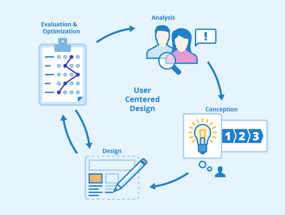
Design
Conceptualisation
Analysis
Evaluation &
Optimisation
USER CENTERED DESIGN PROCESS
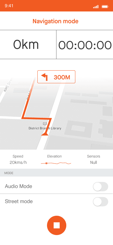
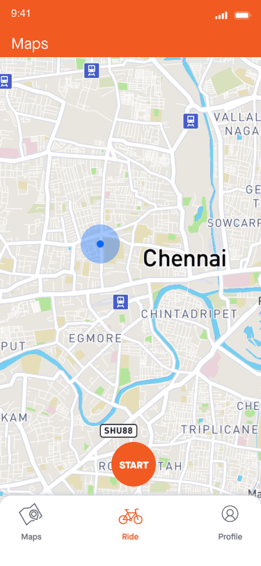
HIGH fidelity SCREENS
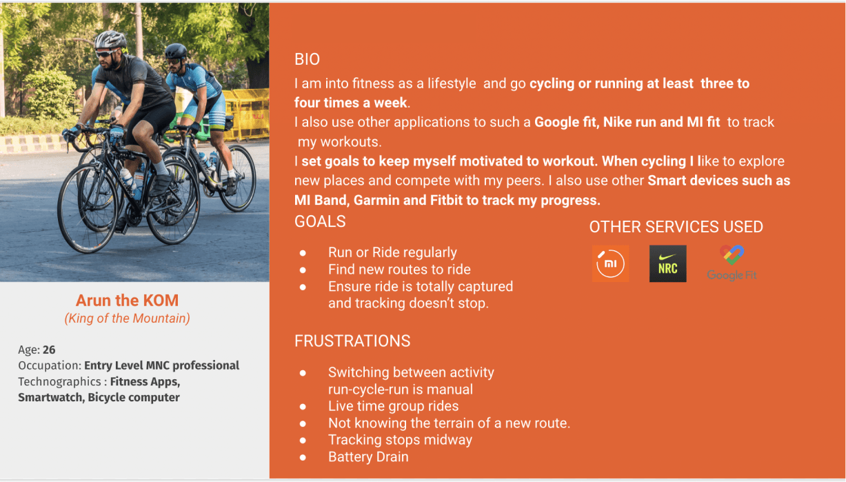
Persona
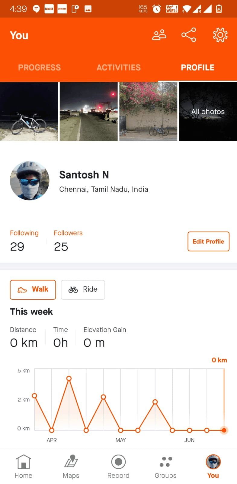
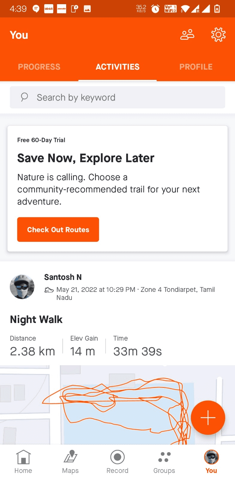
Existing key screens
With my interviews and usability testing I was able to boil down to one specific persona
Route function is unused by all the candidates
google maps is preferred.
Uses google maps instead to plan rides.
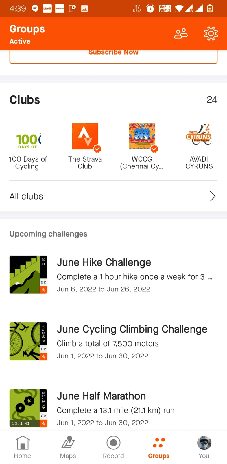
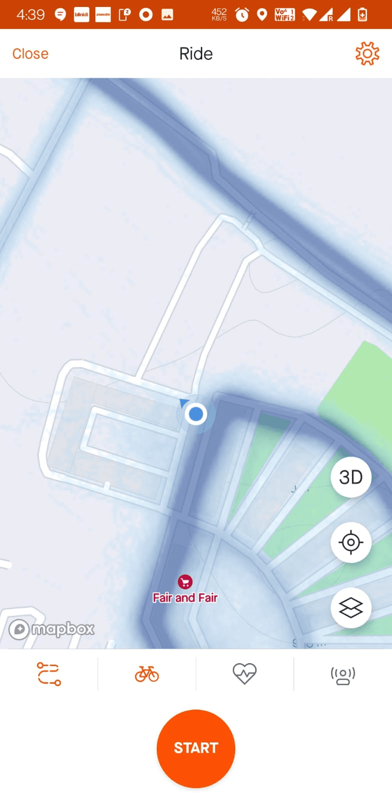
Routes
Maps/Segments are viewed only after the ride
To see elevation and record such as Kudos
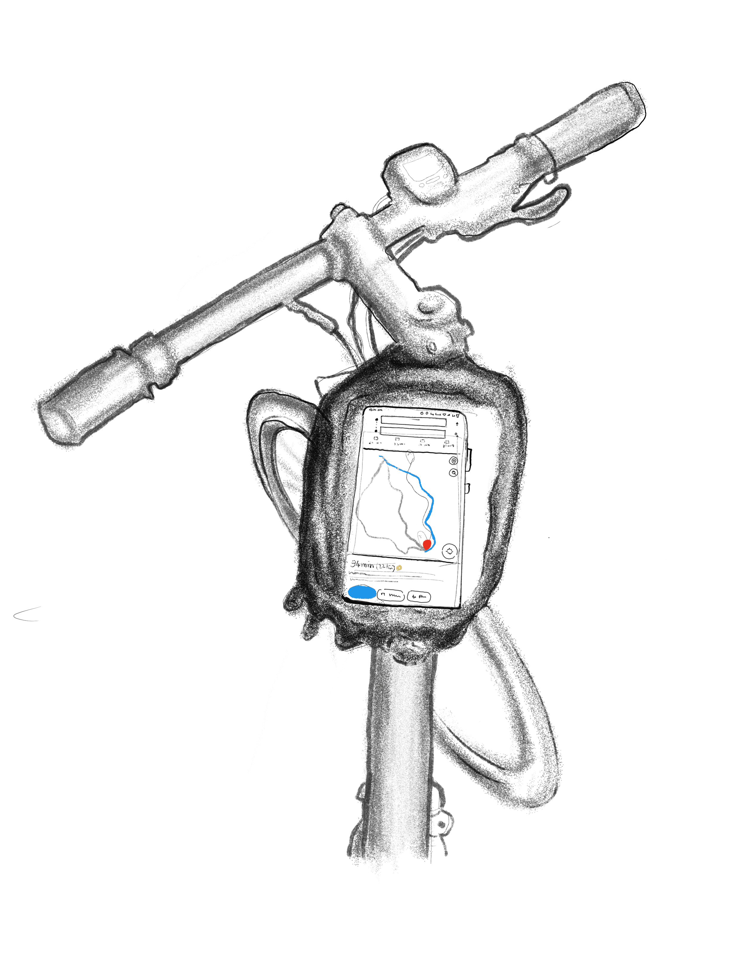
Maps

END-LESS

UI Design
Audit
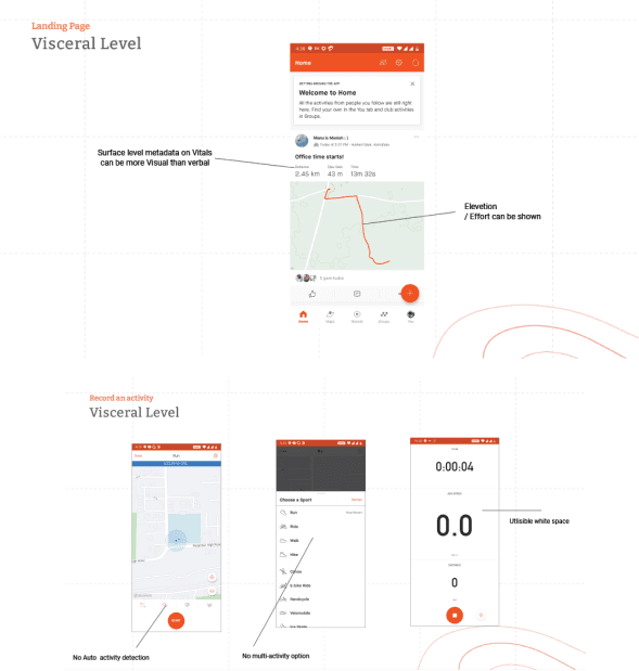
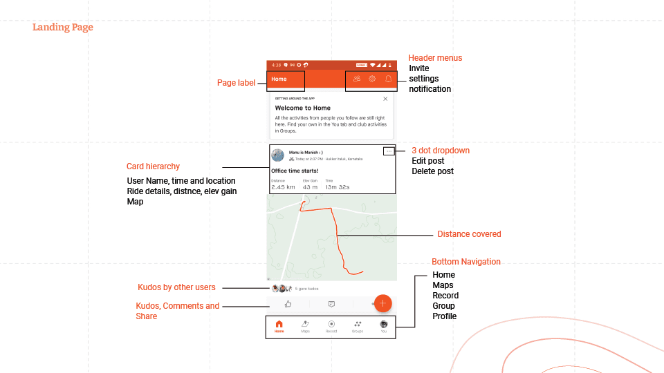
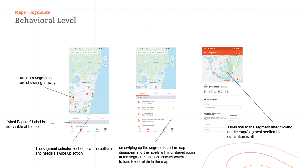
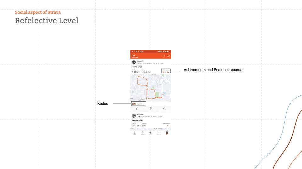
The Audit was done on all key screens to understand areas of improvement on Visceral , Behavioural & reflective levels of the app
Findings
No navigation
tools
App usage
drains
cellphone
battery.
Too many
contianers
Placement of
buttons
is distracting.
Kudos can be
motivational
& de-motivational
at the same time
Strava lacks
options for
multiple modes
of workout
Unnecessary
extra steps
within app.
Excessive
white
space
could be
put to use.
Training plans
are only
accessible from
desktop.
Interaction
while cycling
is an issue
Social aspect
of the app makes
it heavy
Map functions
are restrictive
No indication
when the app
stops
When GPS
disconnects
no data or
inaccurate date
is recorded.
There is
no offline mode
when going
for long rides
Areas of improvements that have been observed during the study where as follows, which will be taken forward to form the design decisions after validation
LEARNABILITY:| MEMORABILITY | ERRORS | SATISFACTION:
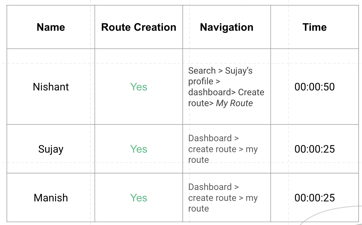
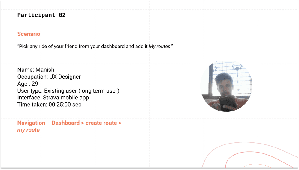
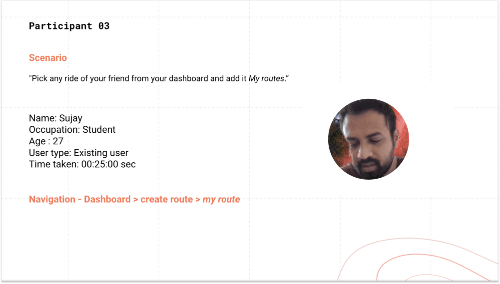
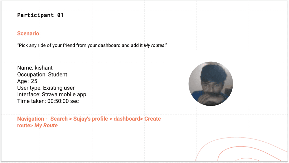
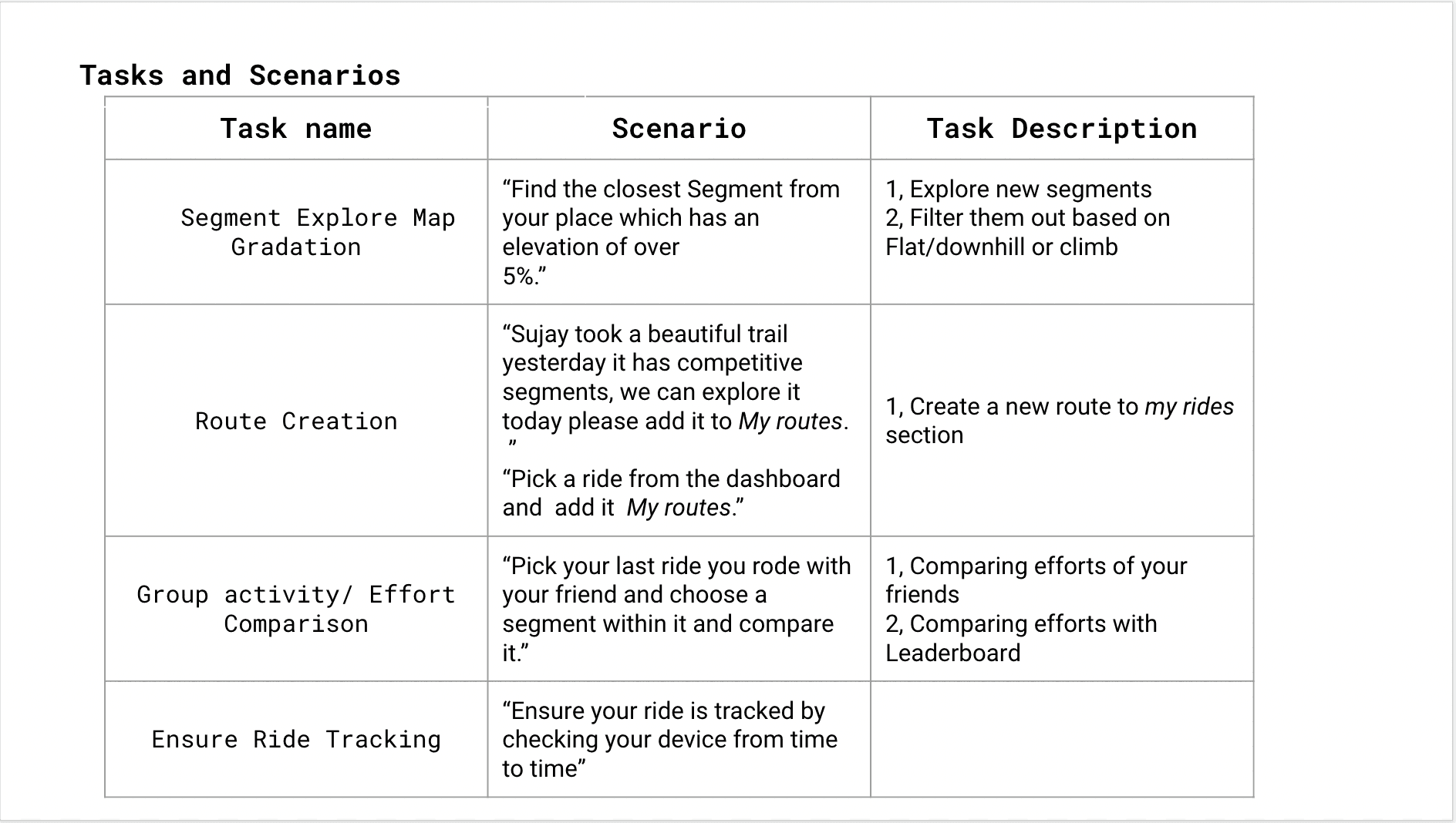
USABILITY tESTING TASKS & SCENARIOS

USABILITY
EMPATHY MAPPING
Says
Says
Says
Thinks
Feels
Does
• Athletic
• Enjoys running
Enjoys biking
Too many different apps for fitness.
Fitness data wouldn’t share between all apps.
App won’t automatically recognize
when the workout starts and ends.
•Goes for regular rides and runs.
•Records activity data using Strava
and other fitness apps.
•Posts accomplishments on social media.
•Annoyed when the app stops working during the ride and tracking stops in the middle.
•Can share accomplishments with peers on Strava.
•Can post to instagram to show off athletic abilities.
•Should get best athletic gear to have in pictures that are posted.

ECOSYSTEM MAPPING

Sensors
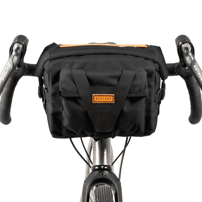
Carriages
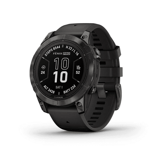
Smart watch
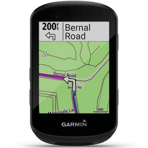
Navigation
Hydration


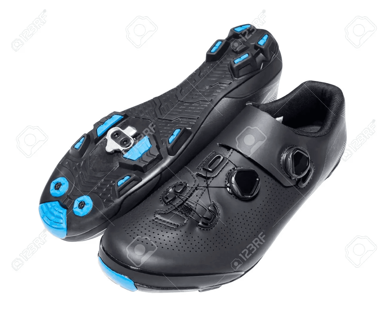
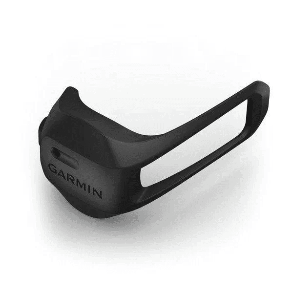
Attire
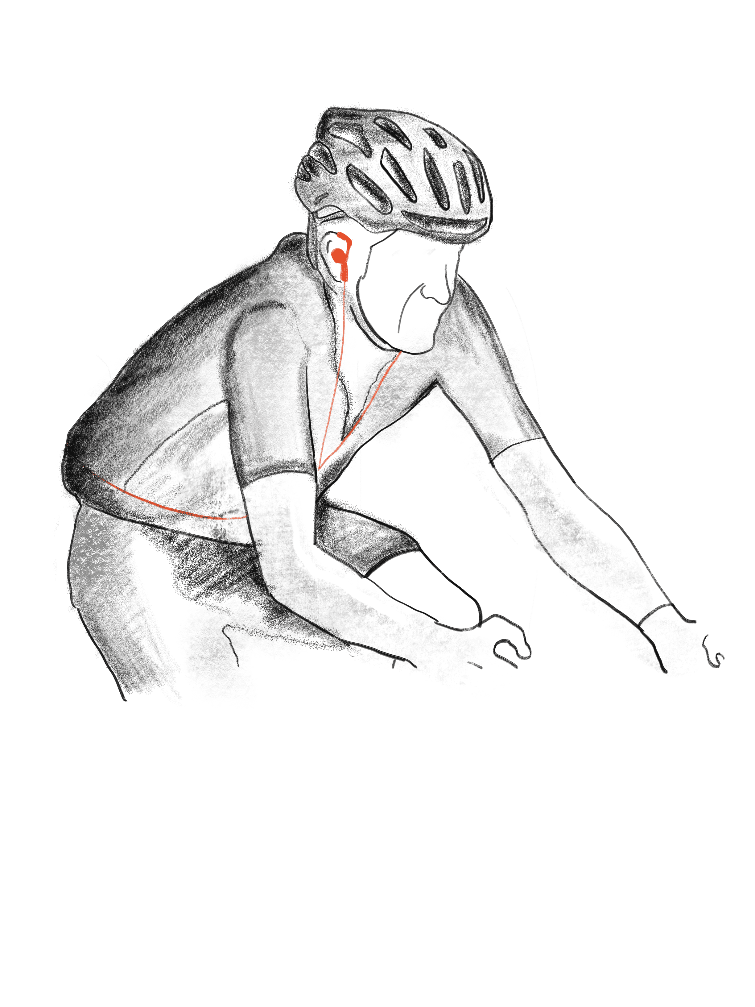
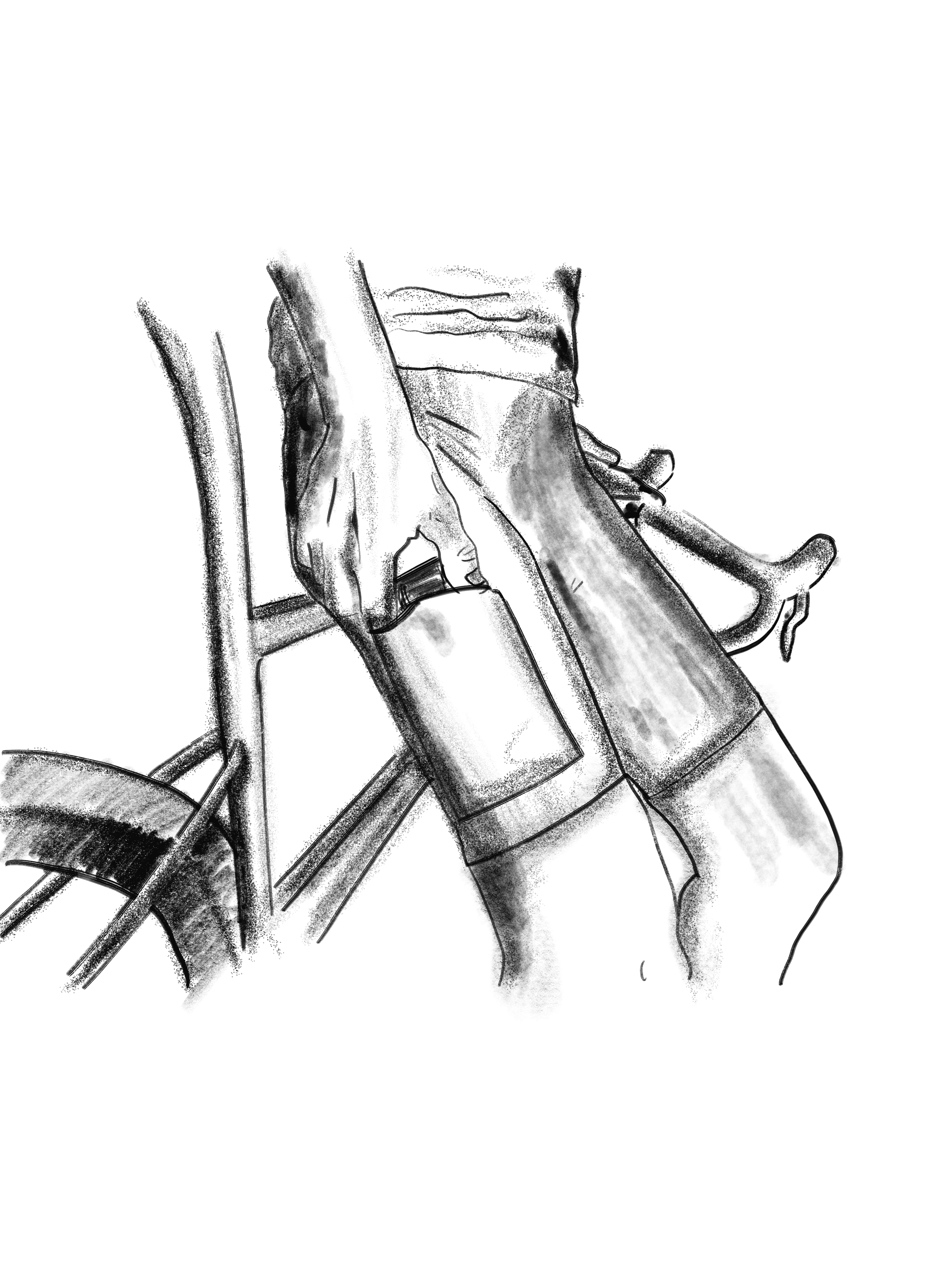
Scenarios
Final Direction
Scenario 02
Scenario 03
Scenario 01
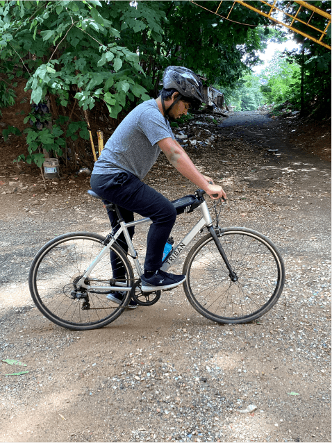
SOME CYCLIST LISTEN TO MUSIC WHEN THEY RIDE
SOME CYCLIST PUT THEIR PHONES IN THEIR PRODUCT
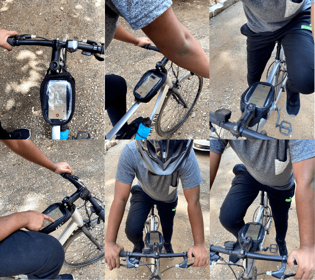
SOME CYCLIST PUT THEIR PHONES ON THEIR FRONT SADDLE
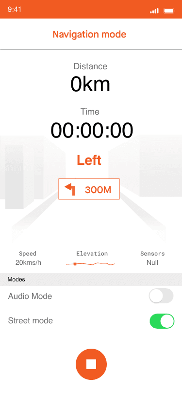
3 Design Directions to consider
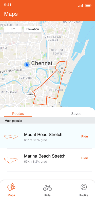
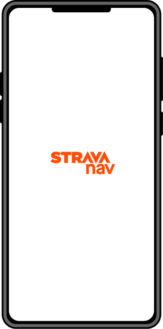
An Audio Navigation system
A light app that focuses on Nav with in built maps
Google map + Starva sync
Information Architecture
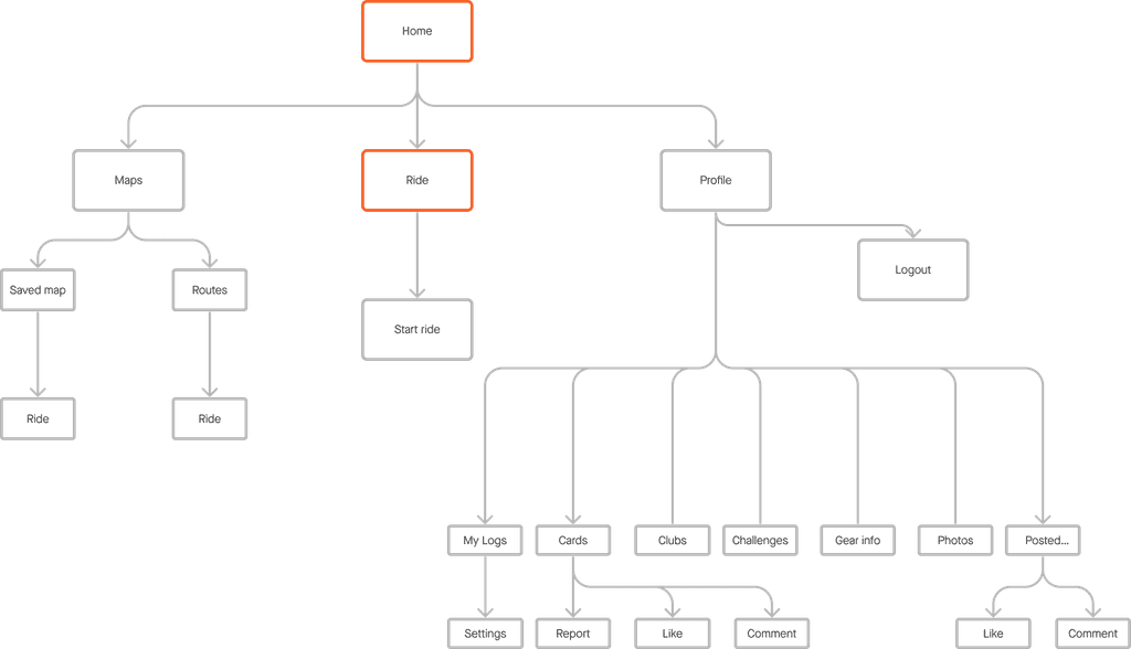

REVALIDATING
Information Architecture